
Builder Mode - Buttons
Lets you set properties of the button area
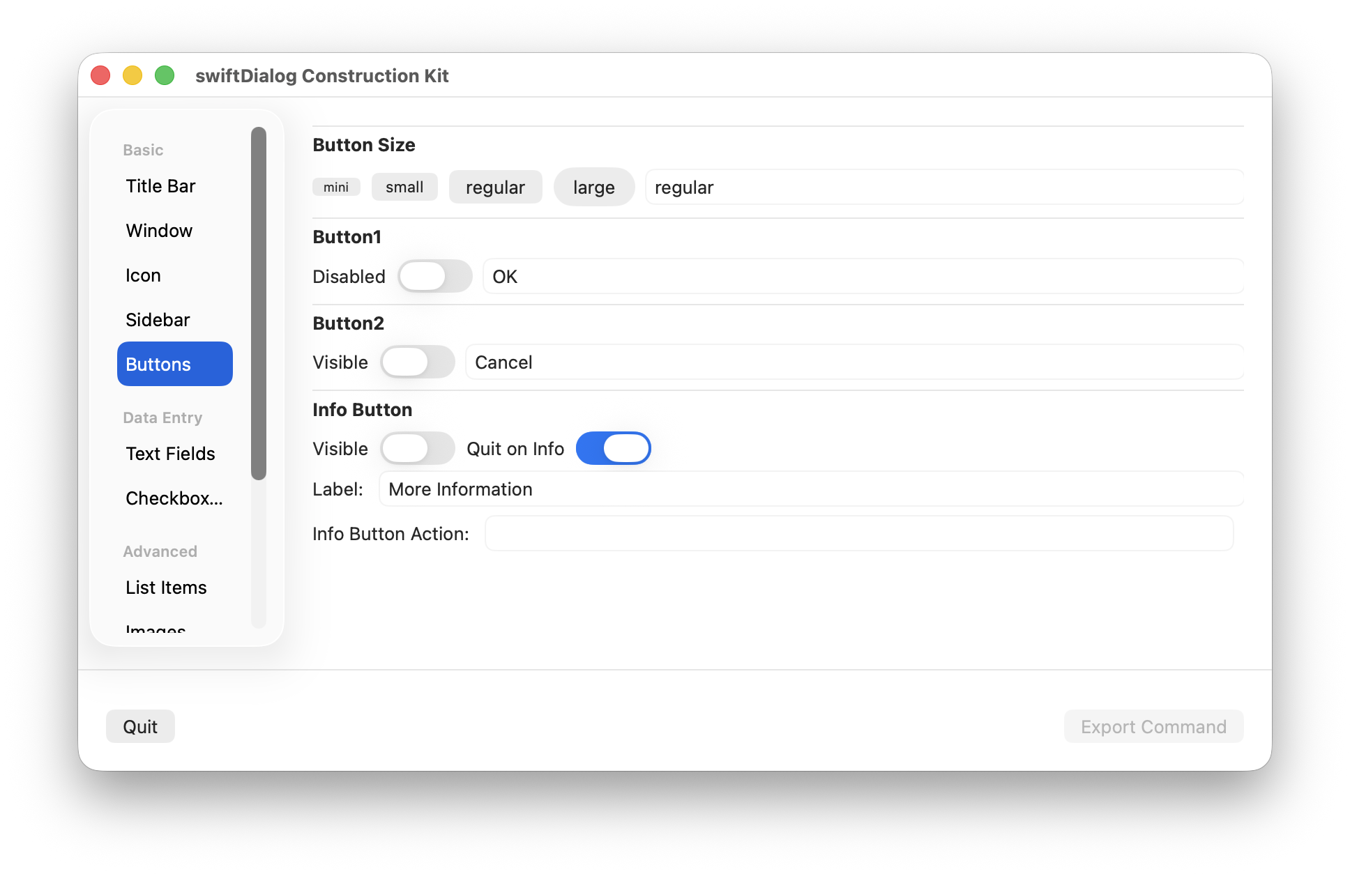
Button Size
Section titled “Button Size”Set one of four button sizes (affecta all buttons)
- mini
- small
- regular (default)
- large
Button 1
Section titled “Button 1”Sets the text to display on Button 1 - aka the default button
Default "OK"
The “Disabled” setting will set the state of button 1 to disabled (to be re-enabled via button1: enable command file command)
Button 2
Section titled “Button 2”Set the text to display on Button 2
Default "Cancel"
Info Button
Section titled “Info Button”Set the text to display on the Info Button
Enable “Quit on Info” so the dialog will exit when the info button is clicked
Set “Info Button Action” to a URL to open when the button is clicked.
Symbol
Section titled “Symbol”Button 1, Button 2 and the Info Button can each display an SF Symbol alongside their label. The symbol editor exposes the symbol properties as individual controls:
- SF Symbol name
- Position — leading, trailing, top or bottom
- Render mode — hierarchical, monochrome, multicolour or palette
- Colour — a single colour, or 2–3 palette colours when palette render mode is selected
- Custom size
A live preview of the composed symbol is shown, and the button updates in the dialog preview as you edit.