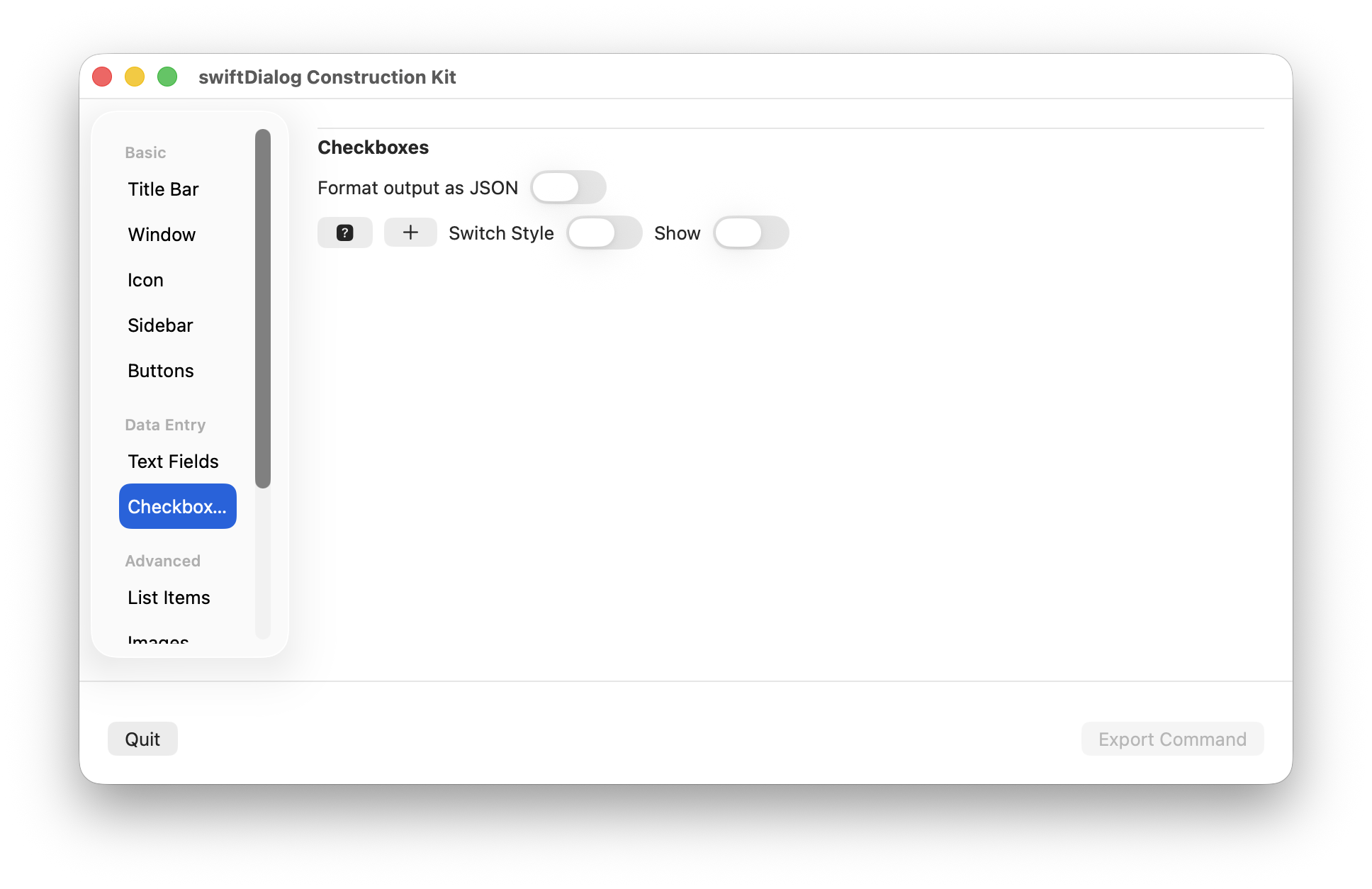
Builder Mode - Checkboxes
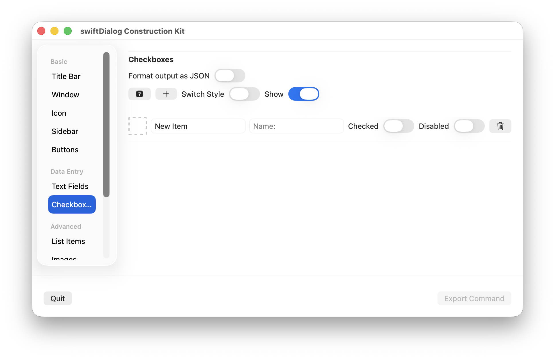
Add one or more checkbox items to the dialog
Click the [+] button to add a new entry to the checkbox item list
Click the trash icon to remove a checkbox entry
Properties
Section titled “Properties”Format output
Section titled “Format output”Set whether the output of the dialog uses json or not
Help button
Section titled “Help button”Click to see the --checkbox help description
Enables or disables visibility of the checkbox display
Switch Style
Section titled “Switch Style”Enables switch style. When not selected, checkbox style is used
Only available when switch style is enabled
Drop an image or app bundle onto the icon preview to set the icon value
Click the icon preview area to set an SF symbol and colour
Set the text of the checkbox label
Set the name value for the checkbox. When used, the name property will be displayed in the output to identify the checkbox instead of the label
Checked
Section titled “Checked”Sets the initial state of the checkbox
Disabled
Section titled “Disabled”Sets the disabled state of the checkbox