Select Lists and Radio Buttons
Dialog has the ability to take a list of values and display them as a dropdown with optional default selection.

How to Use
Section titled “How to Use”Select List title
Section titled “Select List title”--selecttitle <text>(,radio|required|searchable|multiselect|name="<text>")
Set the label can be given to the list with the --selecttitle command line option.
e.g. --selecttitle "Select an Option"

This name will appear in swiftDialog output on STDOUT with the value of the selected item. For a single select list, standard output format will be:
"SelectedOption" : "<value>" "SelectedIndex" : <index> "<name>" : "<value>" "<name>" index : "<index>"Multiple --selecttitle arguments may be specified. Related --selectvalues and --selectdefault arguments can be specified and are associated to a select list in the order they are presented
If multiple select lists are used, “SelectedOption” and “SelectedIndex” are not represented.
Output of select items is only shown if swiftDialog’s exit code is 0
Select List Values
Section titled “Select List Values”--selectvalues <text><csv>
Values are specified in CSV format and passed in using the --selectvalues command line option
e.g. --selectvalues "Option 1,Option 2,Option 3,Option 4, Option 5"

Select List Default
Section titled “Select List Default”--selectdefault <text>
The default option cen be set using the --selectdefault command line option
e.g. --selectdefault "Option 4"

If a default value is not specified, and the user does not select an item from the list, no output is given.
example output:
SelectedOption: Option 1 SelectedIndex: 0Output of select items is only shown if Dialog’s exit code is 0
JSON Schema
Section titled “JSON Schema”The configuration can be specified using JSON for more direct control.
{ "selectitems" : [ { "title" : "Select Item", "name" : "altname", "values" : ["red","green","blue"], "default" : "red", "required" : false, "style" : "default | radio | searchable | multiselect" } ]}Examples:
Section titled “Examples:”"selectitems" : [ {"title" : "Select 1", "values" : ["one","two","three"]}, {"title" : "Select 2", "values" : ["red","green","blue"], "default" : "red"}]
"selectitems" : [ {"title" : "Pick One", "values" : ["One","Two","Three"], "style" : "radio"}]Modifiers
Section titled “Modifiers”Causes the output to be recorded with the specified name instead of using the title
% dialog --selecttitle "Alternate Name",name=alt --selectvalues "Option One, Option Two, Option Three"
"SelectedOption" : "Option One""SelectedIndex" : 0"alt" : "Option One""alt" index : "0"
Searchable
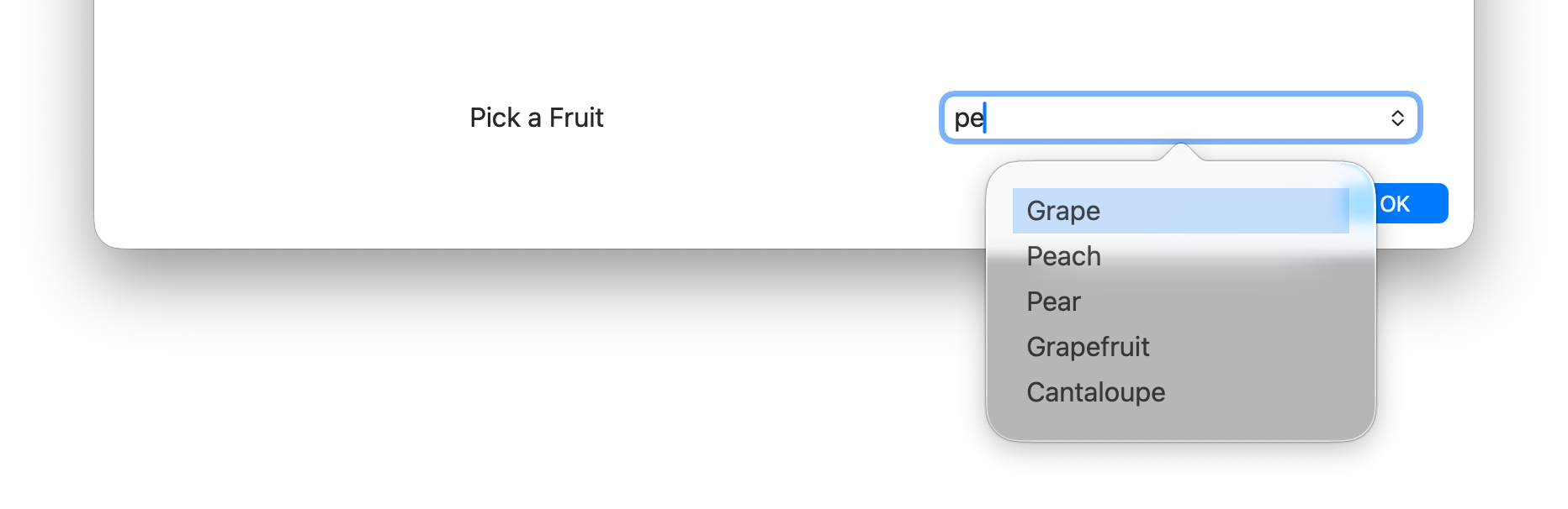
Section titled “Searchable”The searchable modifier adds a search field to the list. Typing in the text box will filter the list.
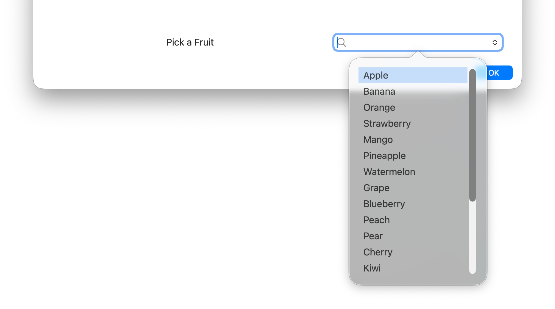
The radio modifier will change the select list to display a group with radio buttons. When using radio with no default item specified, the first entry in the list will become the default selected item. As such, using radio buttons always forces one of the values to be selected and modifiers like required are ignored.
--selecttitle "Radio buttons",radio --selectvalues "Option One, Option Two, Option Three"

Required
Section titled “Required”The required modifier will make that particular list a required item that must have a value before swiftDialog will exit
--selecttitle "Required item",required --selectvalues "Option One, Option Two, Option Three"


Multiselect
Section titled “Multiselect”The multiselect modifier allows more than one option to be selected from the list. Selected items appear as removable tags and the output is a comma-separated list of the chosen values.
--selecttitle "Choose options",multiselect --selectvalues "Option One, Option Two, Option Three, Option Four"
When using multiselect, the selected values are returned as a single comma-separated string:
"Choose options" : "Option One, Option Three"Or in JSON format:
{ "Choose options" : "Option One, Option Three"}Global Style
Section titled “Global Style”--selectstyle [list | radio | searchable | multiselect]
Sets the display style for all select list items in the dialog. This is a global equivalent of setting the style modifier on every --selecttitle individually. Per-list style modifiers on --selecttitle take precedence over this global setting.
| Value | Description |
|---|---|
list | Standard dropdown menu (default) |
radio | Radio button group |
searchable | Dropdown with a filter text field |
multiselect | Searchable field that allows multiple selections |
Adding sections to the list
Section titled “Adding sections to the list”Add three or more hyphens --- into your list wherever you need a divider in your list
--selectvalues "Option One, Option Two, ---, Option Three, Option Four, ---, Option Five"

NOTE: each --- will count in the index even though the divider itself is not selectable. In the above example there will be 7 items in the list array even though only 5 are displayed in the menu. Please take this into account when constructing your select lists
Output
Section titled “Output”Dialog will output the user selected value (or default value if given and the user selects no value) to stdout on exit. This output can be parsed by a script and acted on accordingly.
There are two lines in the output.
- The first line is the text of the list item and will be output as
SelectedOption: <text of item> - The second line is the index of the item selected and will be in the format
SelectedIndex: <index of item>
The index starts at 0 so if the third item in the list is selected, the output of SelectedIndex will be SelectedIndex: 2
Example reading output
Section titled “Example reading output”given the following output:
SelectedOption: Option 4 SelectedIndex: 3pass through grep and awk to obtain the value you want to process
| grep "SelectedOption" | awk -F ": " '{print $NF}'
or
| grep "SelectedIndex" | awk -F ": " '{print $NF}'
Adding multiple select lists
Section titled “Adding multiple select lists”To add multiple select lists, simply specify multiple instances of --selectvalues --selecttitle and --selectdefault. The title and default will be assigned in the order they are given.
multi select output
Section titled “multi select output”when using multiple select lists the output is modified to allow parsing the various named lists. for example, if using the json above and selecting “two” and “red” will result in the following output:
Select 1 : twoSelect 1 index : 1Select 2 : redSelect 2 index : 0if sending output in json format it would result in the following:
{ "Select 1" : { "selectedIndex" : 1, "selectedValue" : "two" }, "Select 2" : { "selectedIndex" : 0, "selectedValue" : "red" }}